March 6, 2025
A practice shaped by story

In Pursuit Counseling
Carly did not come with a creative brief. She came with a dozen browser tabs open and a quiet knowing that this practice—In Pursuit Counseling—deserved more than a placeholder Squarespace site and a vision she couldn’t quite articulate yet.
She had ideas. Feelings. A vision that hadn’t fully landed yet, but was very much on its way. What she needed wasn’t just branding. She needed a collaborator who could help her make sense of it all, bring shape to what she’d been carrying for years, and build something honest enough to hold the kind of work she does every day. The kind of work that sits with people in their messiest chapters and offers a way through.
So we started where she was. No rules. No pressure to perform. Just the kind of process that listens first, then builds something worth saying. We shaped a full brand strategy and identity, then brought it to life through a custom website and a quiet, confident visual language that feels exactly like her.
Brand Positioning
Visual Identity
Verbal Identity
Logo Design
Art Direction
Web Design
Web Development
Website Copy
Gabriel Altvall
03


BRAND POSITIONING
A brand with a big heart
The brand process began with conversations. Not just about therapy, but about what it feels like to reach for help in the first place. What surfaced was a shared understanding: the therapy space is often filled with generic solutions, softened language, and promises that don’t quite land. But Carly’s approach was different. In her world, progress doesn’t come from fixing symptoms. It comes from understanding the story behind them.
Any meaningful change that stands the test of time starts and ends with people, and that belief became the heart of the brand. We positioned In Pursuit Counseling around a clear purpose: to guide people toward meaningful change by honoring the stories that shaped them.

A soft place to land
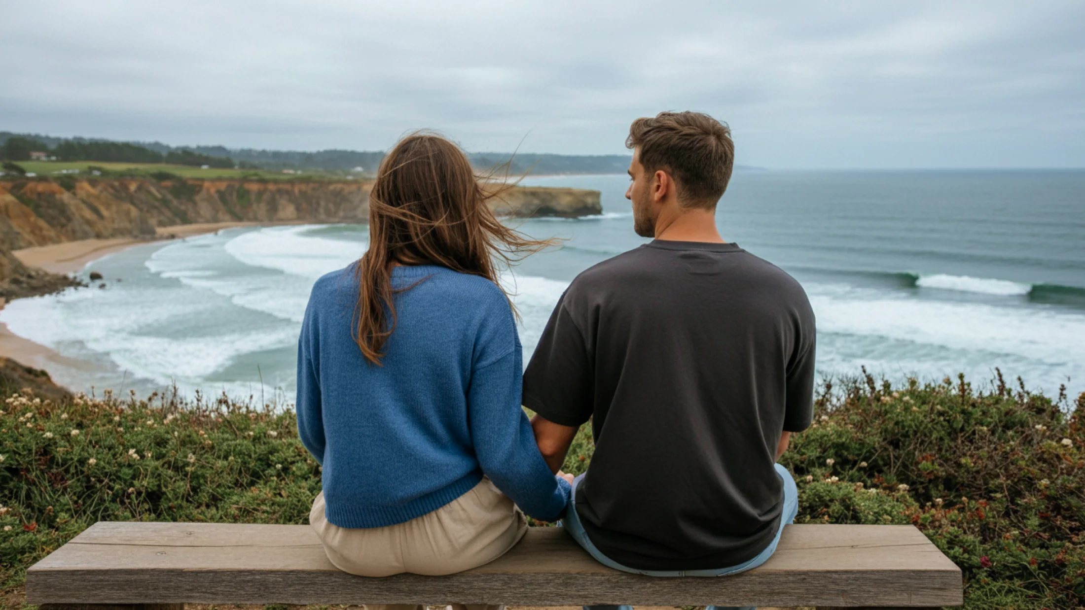
The visual identity was shaped to reflect what In Pursuit Counseling offers at its core: calm, clarity, and emotional presence. Nothing here tries to stand out for the sake of it. The strength of the brand comes from how gently it holds space for people, creating a sense of ease from the first impression. Every detail is designed to support that feeling—considered typography, cool-toned colors with warmth, and layouts that give room to breathe. The result is a brand that feels honest and steady. A place to land when everything else feels a little too much.


A practice shaped by story
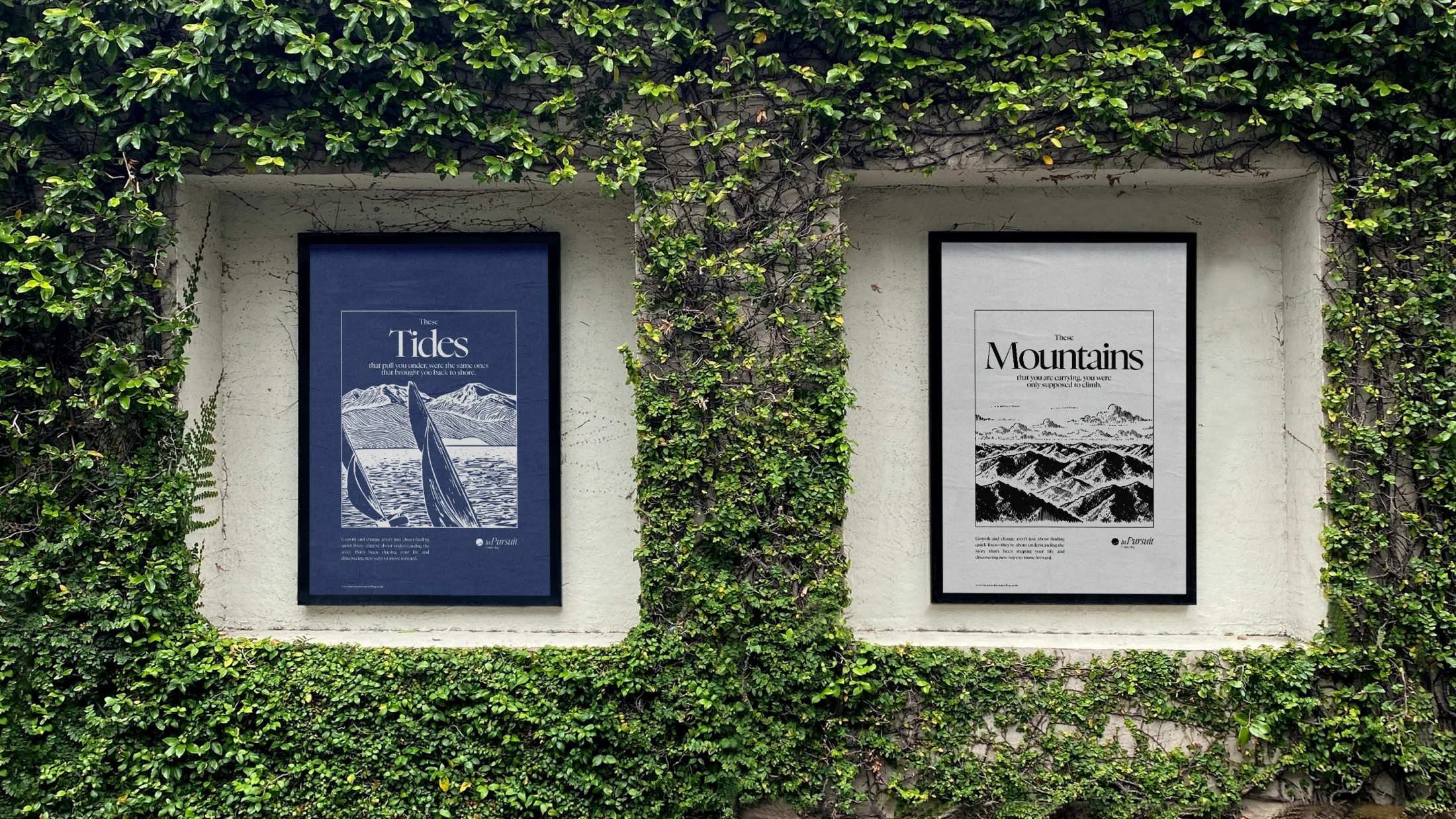
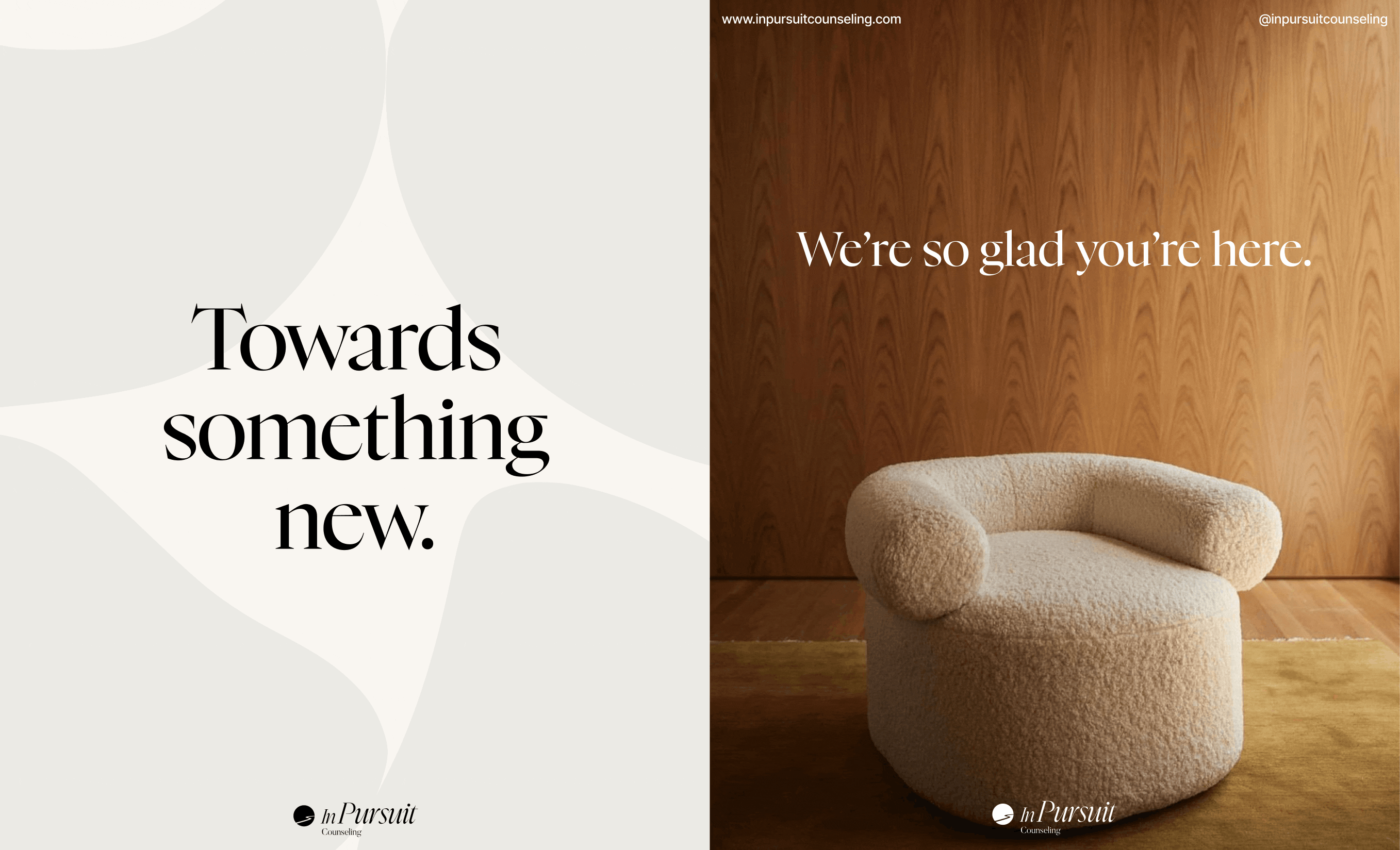
“Towards something new” wasn’t just a line. It was something Carly brought into the process early on: something she said often, and something she meant. We used it to anchor the brand around a bigger idea: that therapy isn’t just about understanding the past, but moving toward a future that feels possible. This belief shows up in everything, from the way the copy speaks to the way the brand holds space quietly to the billboard below. It’s a message for her clients, yes, but it’s also a message for all of us.

A visual language that listens
The brand leans into quiet momentum. This wave-like backdrop isn’t just for show, it mirrors the gentle shifts that happen in therapy. Forward motion. Tides turning. A visual cue that change doesn’t have to be loud to be real.

Language that holds the door open
The voice of In Pursuit Counseling isn’t loud or overly polished. It’s steady. Warm. Clear enough to feel true, soft enough to feel safe. We shaped a verbal identity that doesn’t try to fix or convince, but invites. The kind of language that makes space instead of taking it. You’ll find it everywhere, from handwritten cards to site copy to the quiet welcome on the website of In Pursuit Counseling. Nothing here tries too hard. It just meets you, where you are.


What if this is the start of something better?
Launching this brand was never about making something flashy. It was about making something that feels right. Something that welcomes people in and helps them feel seen before a single word is said. From the first conversation to the final design, everything here was shaped with intention, with the kind of care that doesn’t just look good, but feels good. Because the truth is, most people don’t need more noise. They need something steady to hold onto. That’s what this brand offers. And now, it’s ready to meet the world.